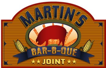
Well here it is..........after much toil, Katie "All-Star" Walker out of Louisville, KY got this design finished for me. She was SO patient with me through this process!!! I am very thankful and blessed to have had her as my graphic artist.....she really is an awsome talent! I am very, very happy with the design, its very exciting! this particular color scheme is what will be on the sign on the road and over the door. I really like the mustard-yellow background but really chose this color combo because of the visibility from the road. It should bring attention to itself. There will be other color combo's for the t-shirts, caps etc.. Will start work this week inside the joint. I will mainly be doing some demo work in there on a partition wall and some other minor stuff. If I can get all that done in time for the contractor to get in there and do what he's going to do that will be great! I am hoping the guy can make time for me week after next. Will be picking the cooker up on the 11th so ive got to get the exterior done by then at least! Had a great time today at the beer festival......ill post about that with a pic later on. I've been fretting about this design for a month so please feel free to post your opinions about the logo, especially the good ones!
That looks freakin good
ReplyDeleteBig P!!!!!! Can't wait til' I can have your BBQ anytime I want it!!!!
ReplyDeleteThe LOGO looks awesome! Looking' forward to being there every weekend...piggin'...pickin'...partyin'...
See ya Hoss,
awesome....cant wait to get the tshirt.
ReplyDeleteGiven all the babies in your extended 'family' have you thought about onesies (sp?) maybe with a slogan clever tag line like Jim & Nicks 'you can smell our butts for miles'.....
sign looks good, very professional but not pretentious, if ya know waht I mean
ReplyDeleteYour name is great...Martin's Dixieland BBQ. Much better and more memorable than just Martin's.
ReplyDeleteI only heard 'Dixieland BBQ' one time, and I remembered it. Didn't even have to think about it.
Martin's BBQ, I keep having to look up.
Dixieland is a much better name, and would great on the sign and would be easy to design a logo around.
So there's your logo? Where's 'Dixieland'?
"Dixieland" may have to be scratched because the limitations put upon me by the city (codes) on the size of the sign, which dictates the font size and visibility of the sign itself. the max size of the sign they will allow me to have for a commercial business is so small its stupid! For the letters to be large and visible from the road we decided to drop "dixieland" and insert "martins" instead. i agree that "dixieland bar-b-que" and/or "martins dixieland bar-b-que" sounds better but this is the hand i've been dealt and i'm playing it. i DO plan on having dixieland on everything else (t-shirts, caps, etc..) just not the sign on the road.....too many letters to fit in a small space.
ReplyDelete